Wednesday, May 5, 2010
Tuesday, April 27, 2010
Monday, April 26, 2010
Saturday, April 24, 2010
The Last Journal.
I think one thing that really inspired me this semester was Bruce Mau's Incomplete Manifesto for Growth. I thought his beliefs on how to approach every project where not only true but fun. There were some beliefs that I have always followed, such as laughing and not cleaning my desk. But some beliefs I had fun learning about such as reading only left-handed pages, take field trips, forget about good, and begin anywhere. It was good for me to read these simple approaches and try to apply them to my projects.
Journal 13
Larry Lessig on laws that choke creativity
Internet could revive the read-write culture. flickr, youtube, and myspace where people produce for the love of what they are doing and not for the money. Recreating using technology to say things differently. The technique has been democratized it is now anybody with access to a computer who can take sounds and images from the culture around us and use it to say things differently. It is a literacy for this generation. These activities should not be illegal.
Balance- private solution. 1. the artists and creators choose to have their work be available for more freely amateur use. 2. business need to enable free-er content.
He mad a good point that kids today live knowing they are disobeying the law and this is corrosive. In a democracy there should be a solution to this problem.
Tuesday, April 20, 2010
Sunday, April 18, 2010
Journal 12
Paula Scher
I liked how she made the point that her experience adds to her process. Especially when she was talking about the citi logo that she designed in a second. But really it was the years and years of experience that helped her design the logo.
David Carson
Pull from who you are as a person and put that into the work. The starting point is trying to interpret something not trying to make it award winning.
Lawrence Weiner
I watched this one because Lawrence Weiner looked like an interesting character....and boy was I right. You are in the stream of life whether you like it or not. And if you are going to be in the stream of life than you have to accept the responsibilities I would like a few more pleasures but there doesn't seem to be time. Wants to set up a pattern for people to figure out where they are. He sees design as a way to take notes on the world. Design is of the moment.
Journal 11
Who is Debbie Millman?
The President of the design division at Sterling Brands, an international design consultancy. She has been there for fourteen years and in that time she has worked on the redesign of global brands for Pepsi, Procter & Gamble, Campbell’s, Colgate, Hershey and Hasbro. Debbie is President of the AIGA, the professional association for design. She is a contributing editor at Print Magazine and the chair of the new Masters in Branding program at the School of Visual Arts.
What is Design Matters?
In 2005, she began hosting “Design Matters with Debbie Millman,” the first weekly radio talk show about design on the Internet.
This was long but had some good points. Branding is just as much about the experience as it is the product. It isn't just about the logo but the whole experience. Far more companies today are realizing that everything defines the brand experience not just a logo or sign. He also made the point to have a great website and get your work out there on the web and on blogs.
Sunday, April 11, 2010
Journal 10
Infographic
I really liked how easily the information was presented. Could be a little more exciting.
Videos
The State of the PlanetThis was a pretty good video and the transitions were smooth. But mostly I liked the content of the video more than I really liked the video. It got a little boring because it got pretty predictable after a while.
I have watched this video before and I really enjoyed watching it again. The color scheme was a given but still appropriate for the film. I liked the mix of the background song with the words and random sounds. Great transitions and movement from one thought to the next.
I really liked the style in this video. The sketches look really cool and worked well for the video.
I liked how this video used animation that looked like a 2D space and then also used animation that looked like a 3D space. The contrast was really compelling as were the layers in the animation.
Sunday, April 4, 2010
Speech
Address on Vietnam War by Spiro Agnew
“Sometimes it appears that we’re reaching a period when our senses and our minds will (pause) no longer respond to moderate stimulation. We seem to be approaching an Age of The Gross. (pause) Persuasion through speeches and books (p) is too often discarded for disruptive demonstrations (p) aimed at bludgeoning the unconvinced into action.
The young (p)– and by this I don’t mean by any stretch of the imagination all the young, but I’m talking about those who claim to speak for the young (p) – at the zenith of physical power and sensitivity, overwhelm themselves with drugs and artificial stimulants. Subtly is lost and fine distinctions based on acute reasoning (p) are carelessly ignored in a headlong jump to a predetermined conclusion.
Life is visceral,(p) rather than intellectual. And the most visceral practitioners of life are those who characterize themselves as “intellectuals”. Truth is to them is “revealed” rather than logically proved. And the principal infatuations of today revolve around the “Social Sciences”, those subjects which can accommodate any opinion and about which the most reckless conjecture cannot be discredited.
Education is being redefined (p) at the demand of the uneducated (p)to suit the ideas of the uneducated. The student now goes to college to proclaim (p), rather than to learn. The lessons of the past are ignored and obliterated (p) in a contemporary antagonism known as the “generation gap.”
A spirit of national masochism prevails, encouraged by an effete corps of impudent snobs who characterize themselves as “intellectuals”.
Who is speaking?
Spiro Agnew
Why was/is the speech important to society?
This address is on the Vietnam War, which is the first war in American History that had large amounts of protest. The Vietnam War generated lots of anti-war demonstrations in America. In the speech Vice President Spiro Agnew talks down on anti-war protesters and the press. He comes off as being stuck in the ways of the past and not willing to accept the social changes of the 20th century.
Why do you feel it is important or interesting? I feel that it is relevant now to look at this speech while The United States is engaged in the Iraq war since there are many similarities in the two wars.
What is the emotion, mood, tone, personality, feeling of the speech?
Condemning. Political. Bland. Harsh. Close-minded.
What is intonation, emphasis, what is loud, stressed, or soft.
Most of the speech is said at the same level not being very loud or soft but placing emphasis on some words more than others.
Where are there pauses...
Is there a call to action? When listening to it what are key/emphasized words? Bludgeoning. Subtly. Visceral. Revealed. Reckless. Proclaim. Gap. Effete.
How does it make you feel? Kinda mad at what he is saying.
How do imagine that the audience felt? Probably politically moved to support America in the Vietnam war.
Write/find a short bio, of the person giving the speech.
Spiro Theodore Agnew was the 39th Vice President of the United States, serving under President Richard Nixon, and the 55th Governor of Maryland. He was also the first Greek American to hold these offices.
During his fifth year as Vice President, in the late summer of 1973, Agnew was under investigation by the United States Attorney's office in Baltimore, Maryland, on charges of extortion, tax fraud, bribery and conspiracy. In October, he was formally charged with having accepted bribes totaling more than $100,000, while holding office as Baltimore County Executive, Governor of Maryland, and Vice President of the United States. On October 10, 1973, Agnew was allowed to plead no contest to a single charge that he had failed to report $29,500 of income received in 1967, with the condition that he resign the office of Vice President.
Agnew is the only Vice President in U.S. history to resign because of criminal charges. Ten years after leaving office, in January 1983, Agnew paid the state of Maryland nearly $270,000 as a result of a civil suit that stemmed from the bribery allegations.
Agnew soon found his role as the voice of the so-called "silent majority", and by late 1969 he was ranking high on national "Most Admired Men" polls. He also inspired a fashion craze when one entrepreneur introduced Spiro Agnew watches (a take off on the popular Mickey Mouse watch); conservatives wore them to show their support for Agnew, while many liberals wore them to signify their mocking contempt.
Agnew was known for his scathing criticisms of political opponents, especially journalists and anti-war activists. He attacked his adversaries with relish, hurling unusual, often alliterative epithets — some of which were coined by White House speechwriters William Safire and Pat Buchanan — including "pusillanimous pussyfooters", "nattering nabobs of negativism" (written by Safire), and "hopeless, hysterical hypochondriacs of history".[7] He once described a group of opponents as "an effete corps of impudent snobs who characterize themselves as intellectuals."
Journal 9
Sequence Exercise: This exercise was helpful in thinking about pacing, scale, movement, and unity. Using different sizes of type along with white space to create a unified whole for the magazine book proved more difficult for me than I imagined. It applied to book design because we were creating spreads that had to work well together. It applied to motion graphics because we were creating movement throughout the spreads of the book. Pacing and white space had to be carefully considered to create a piece that looked visually intriguing and flowed well.
Youtube videos:
I Love NY: This type in motions works alright without sound. The words can almost set the mood for the video without music. I liked how it transitions smoothly from one thing to the next and used colors that I thought looked very urban. I liked how some words didn't even need to be read but the motion of what they were doing and the color they were in showed you what they meant. For example when yellow cabs taxi car moves across the screen it is easy to get the sense of a car. With the song playing the mood is set 10 fold and really enhances the video.
Pulp Fiction: Without sounds this video is impossible to understand because of the extreme scale and how fast some words move. With sound this video is successful. Words hit at just the right moment and scale really emphasizes when the man is yelling to make it seem more intense. There are so many motion graphics of movies like this that it isn't really that memorable to me.
The Man With the Golden Arm: Made by the great Saul Bass this motion graphic paved the way. It is brilliant especially when considering that he didn't use programs like after affects. I'm finding that sound always makes a different. The lines react very well with the music and seem to represent it in a way. Simple but memorable.
Experiment: This is the first motion graphic that I like better without sound. But maybe its because the guy sounds so weird. With the guy speaking though you can hear the thinking process better. I liked the break down of experiment into ex.per.i.ment.
We Must: This has been one of my favorites so far. I think why I like it is because its not from a movie. It is a 30 second type in motion that talks about our addiction to oil. The different fonts used were appropriate for the words as well as the colors used. Sound is not totally necessary to understand this video, although the song and the guys voice sets a very serious tone for the video which helps. Scale was used very well at the end to drive the point home. All around it was well made with a good message and that is why it is memorable to me.
Time: This one is in Spanish so I didn't understand a lot of the words, but I really liked it so I thought I would discus it. Once again smooth transitions really helped. I think in this motion graphic sound is a necessity. The ticking sound of the clock combined with the background music is an interesting combo. I liked the type in this one along with the movement of numbers and symbols to really create a strong sense of time. I really like when a lot of the type falls to the bottom of the screen at one point.
1. Catch Me If You Can. I didn't like this movie very much but I loved the opening sequence. The transitions are what really impress me, moving from one scene to another. Often utilizing lines to move from one frame to the next. The change in scale was perfect to hold my attention. The graphic style used was interesting and perfect for the movie.
2. Eurotrip. I remember this opening sequence from when I saw this ridiculous movie when I was 14. The song chosen for the motion graphic sets the mood of the movie perfectly. Good use of scale and easy transitions makes it a great sequence. Taking something like flight rules and making them obscene captured my attention and made me laugh. I liked how simple the graphics and type were.
3. Fight Club. Great movie....great opening sequence. The feeling of moving backwards in this motion graphic makes it feel creepy. The sound and the way the type flashes in sets the intensity of the film. I love the easy transition from the title sequence to the film, starting inside the man with the title sequence and ending up with the man having a gun pointed at him to start the movie...BRILLIANT.
4. Superbad. I chose this sequence just because it sets the mood for the movie so well. The type in the sequence is a little boring. But the simplicity and lightness of the sequence were perfect for the film. The transitions were a little cheesy but once again they fit the job perfectly.
Monday, March 29, 2010
Journal 8
Type Means Never Having to say You're Sorry
"— but the bottom line was: why Futura?"
"Futura was important for a number of reasons: arguably the first sans-serif font to be widely distributed, it has since its inception influenced countless other typefaces and remains, to some, the epitome of modern design."
"Clearly, designers make choices about the appropriateness of type based on any number of criteria, and "liking it" is indeed one of them. There are an infinite number of considerations to be taken into account, from readability to copyfitting to concerns over what works on a screen to what translates into other languages."
I'm pretty sure I have used Futura in a project before. It takes reading an article like this to learn that Futura is over used by designers especially students. Now that I know this I will probably try to use an alternative front to futura for future projects. An alternative to Futura that is geometric is Gill Sans. Other alternatives could be Univers, Syntax, Akzidenz Grotesk and Franklin Gothic.
“We've arrived at a moment where all that has preceded us provides an enormous mother load of graphic reference points, endlessly tempting, endlessly confusing”.
The article was pretty interesting about ripping off other peoples ideas. This can be done intentionally or unintentionally. The article asked a great question: "How much design history does one have to know before he or she dares put pencil to paper?". I think this makes a good point that designers today can be aware about things done in the past, but they probably won't know everything. It is possible to unintentionally design something that looks like a style done in the past.
"We've debated imitation, influence, plagiarism, homage and coincidence before, and every time, the question eventually comes up: is it possible for someone to "own" a graphic style? Legally, the answer is (mostly) no."
Wednesday, March 17, 2010


Monday, March 8, 2010
Timeline Process
Initial Ideas


Original radar color scheme


Original radar color scheme

Switched to a different color scheme with a grey background.

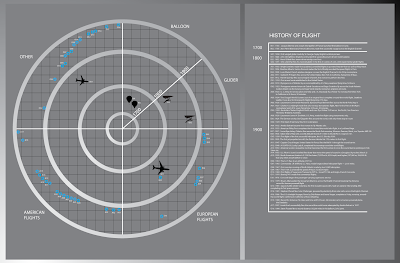

Pulled in some icons to give a clearer idea that the timeline is about flight
Used a different background color and started using red. Some color scheme inspiration from the game battleship.


Went back to a more normal grey but decided to keep some icons red and some blue. Cleaned up the type and now its ready to turn in.

PROJECT BRIEF:
Establishing order: Graphic design often relies on typography to commuicate order, information, and systems. The goal of this project is to make things easy to read, navigate and understand. As you learned in typography one, the foundation for creating an clear informational structure is a a strong typographic hiearchy. Type size, wieght, and color are the the first steps. Graphic elements (lines, arrows, grids) and page structure are often used to aid in establishing a clear hierarchy.
You will need to choose from one of the folllowing timeline choices...
TIMELINE CHOICES:
_ History of the Bathing Suit
_ History of Earthquakes and Volcanic Eruptions
_ History of Photography
_ Prehistoric Timeline
_ 100 years of Flight
CONTENT
_ timeline must have a range of dates
_ intro text
_ each point in time must have a date
_ and each point of time must have at least one sentance
_ images, icons, graphic elements are optional
CHALLENGE
How can you visualize the content? How can the audience get a quick understading about the topic? How are the pulled into the content to find out more?
TECHNICAL RESTRICTIONS
Format: poster or accordian folded book
Size: You determine the final size, poster min. size is 13 x 19 tall or wide
Color: Unlimited color palette
Typography: 2 typefaces, 3 type styles, and no more than 4 sizes of type.
Grid: proportional or ratio modular grid
OVERVIEW: This project was pretty boring but it went well. Once again I learned that if you create a strong concept in the beginning its pretty easy to carry the idea out. I came up with the idea for my project when I did brainstorming with a group of people who were all designing flight timelines. I thought the radar would be an excellent way to show information with both image and text in an organized way. Although timelines can be tedious and boring they are important to provide vast amounts of information to the viewer.
Sunday, March 7, 2010
Thirty Conversations on Design
Little and Co asked 30 designers the same two questions... “What single example of design inspires you most?” and “What problem should design solve next?” Their answers might surprise you.
Greg Hoffman
What inspired him was the mission one motorcycle because it is an amazing innovation. It has little impact on the planet. It does that without sacrificing performance or aesthetics. Not only is the bike visually striking but it also is a great sustainability story.
When asked what problem should design solve next, his answers were very youth focused. I found this intruiging because designers tend not to focus on kids. He wants design to increase youth participation in sport and attack obesity in youth. He said this should be done by focusing on environmental design, equipment design, and communication design.
Sean Adams
Inspired by the Declaration of Independence, because it is put into words that the public can understand. The document is an excellent design of government that has held strong for hundreds of years.
He said the next problem to be solved is the next project you get. As a designer you should do a good job for each client you have so that the clients company does better and the client can keep their job.
Debbie Millman
The pencil is the most inspiring thing to her. She loves every aspect of the pencil especially color pencils.
The Large Hadron Collider along the border of Switzerland and France. Searching for the God Particle. Finding out how we got here and where we're going. I didn't really understand this part, but oh well.
Eddie Nunns
All the efforts going into inclusive design. Architects who are lending their time and talent into low-income housing. Designers who are designing products for every day life. Fashion designers who are designing for different levels. Designing should be available to everyone.
The world of ecology and sustainable energy. There are hybrid cars and solar energy. He said he was inspired by the beautiful white wind turbines in the wide open fields. Designing a better world.
Brian Deputy
The Eames lounge chair and ottoman released to the public in 1956. The design is innovative and transcends time. There is no setting or environment it doesn't enhance. Its got an element of magic because it can make a long day at work disappear.
Design doesn't solve problems, people do...ideas do. Its up to the designer to make the design work. One thing that design doesn't need to create is the perfect chair...because that has already been done.
I am inspired by a couple things but without fail I am always inspired by the technology Apple designs. Its beautiful and it works well. Also every two years I am inspired by the Olympics. I love watching the opening ceremonies. I also love seeing the athletes training pay off when they win.
Tuesday, February 23, 2010
Journal 5 : David Carson
David Carson on design + discovery | Video on TED.com
Great design is a never-ending journey of discover - for which it helps to pack a healthy sense of humor. Carson believes the emotion is picked up in a design before they ever begin reading.
"The intellect has little to do on the road to discovery. There comes a leap in consciousness, call it Intuition or what you will, the solution comes to you and you don't know how or why." Albert Einstein
"When people are engaged in creating a totally different world, they always form vivid images of the preceding world."
David Carson's methods of typography in the 90's brought in a new vision of type and page design - quiet simply, breaking the traditional mold of type on a page and demanding fresh eyes from the reader. Squishing, smashing, slanting and enchanting the words on a layout, Carson made the point, over and over, that letters on a page are art. You can see the repercussions of his work to this day, on a million Flash intro pages and probably just as many skateboards and T-shirts.
Journal 5 : Stefan Sagmeister
Stefan Sagmeister shares happy design | Video on TED.com
I really enjoyed Sagmeisters lists especially the one about things that made him happy while designing:
1. Thinking about ideas and content freely- with deadlines far away
2. Working without interruption on a single project.
3. Using a wide variety of tools and techniques
4. Traveling to new places
5. Working on project that matter to me.
6. Having things come back from the printer done well.
Overall Sagmeister was just very concerned with happiness as a designer. Often in the design world its easy to get caught up in deadlines without remember that designing is something you truly enjoy, not just a job. I really liked the subway stickers that said things like "Do not accept defeat" and "Do not hold grudges". It was a very funny design.
In the article How Good is Good? Sagmeister made another interesting points:
1. Design can unify
2. Design can help us remember
3. Design can simplify our lives
4. Design can make someone feel better
5. Design can make the world a safer place
6. Design can help people rally behind a cause
7. Design can inform and teach
8. Design can raise money
9. Design can make us more tolerant
"Commercial Art makes you BUY things, graphic design GIVES you ideas" - Sagmeister
Journal 5 : J.J. Abrams
J.J. Abrams' mystery box | Video on TED.com
I had to watch the TED talk with J.J. Abram's because Lost is driving me crazy during its last season.
"Technology is mind blowingly inspiring" - Abrams
It was funny to me when he said he was so inspired by his mac computer. He said it inspired him to write scripts that were worthy of being on his computer screen. He also made an interesting point that although technology is great you don't have to have the newest and greatest technology to still make cool stuff.
I thought it was also interesting when he talked about withholding information intentionally. Mysteries intrigue people so you shouldn't give them all the information right away.
Friday, February 19, 2010


Monday, February 15, 2010
Journal 4: Bruce Mau
Copied straight from Bruce Mau's website.
Bruce Mau is a visionary and world-leading innovator. As Chief Creative Officer of Bruce Mau Design, he proves that the power of design is boundless, and has the capacity to bring positive change on a global scale.
Throughout the years, Mau has gained an international reputation for his commitment to interdisciplinary and purpose-driven innovation. As the creative force driving studios in Chicago and Toronto, he recognizes that the complex challenges of the future demand innovation across disciplines and industries. In the fall of 2009, Mau was given the distinguished Louise Blouin Foundation Award at the Global Creative Leadership Summit for his exceptional creative achievement. In 2007 Mau was presented with the AIGA Gold Medal for communication design. He was named the Bill and Stephanie Sick Distinguished Professor at the School of the Art Institute of Chicago.
Growth is fueled by desire and innocence. Assess the answer, not the question. Imagine learning throughout your life at the rate of an infant.
32. Listen carefully.
Every collaborator who enters our orbit brings with him or her a world more strange and complex than any we could ever hope to imagine. By listening to the details and the subtlety of their needs, desires, or ambitions, we fold their world onto our own. Neither party will ever be the same.
Every collaborator who enters our orbit brings with him or her a world more strange and complex than any we could ever hope to imagine. By listening to the details and the subtlety of their needs, desires, or ambitions, we fold their world onto our own. Neither party will ever be the same.
I like these two rules together because why ask a stupid question if you're too stupid to listen. Often times I get too nervous to ask what I really want to ask. Then when someone is telling me the answer I miss half of the details. This week my mantra is a collaboration of these two rules: To ask stupid questions and then listen carefully.
Sunday, February 14, 2010


Saturday, February 13, 2010
Journal 3: 20 Rules
In the article Twenty Rules for Making Good Design, David Jury acknowledges the fact that rules can be broken but not ignored "In the end, you will decide how and when to apply the rules, or not, as well as understand the results of either course of action."
The 20 rules stated in the article:
1. Have a concept
2. Communicate don't decorate
3. Speak with one visual voice
4. Use two typeface families maximum. OK, maybe three
5. Use the one-two punch!
6. Pick colors on purpose
7. If you can do it with less, then do it
8. Negative space is magical- create it, don't just fill it up!
9. Treat the type as image, as though it's just as important
10. Type is only type when it's friendly
11. Be universal; remember that it's not all about you
12. Squish and separate
13. Distribute light and dark like firecrackers and the rising sun
14. Be decisive. Do it on purpose- or don't do it at all
15. Measure with your eyes: design is visual
16. Create images- don't scavenge
17. Ignore fashion. Seriously.
18. Move it! Static equals dull
19. Look to history, but don't repeat it
20. Symmetry is the ultimate evil.
The 3 most important rules to me are:
1. Have a concept.
This seems like it deserves a duh! after it but often times I jump into a project and forget to really ever come up with a solid concept.
2. Negative space is magical- create it, don't just fill it up!
Often times negative space is overlooked, but it is a major part of design.
3. Symmetry is the ultimate evil.
"Symmetry shouts very loudly that the designer is lazy and likes to let the format do the designing."
The 3 I need to practice more are:
1. Communicate- don't decorate.
"It's all well and good to experiment with shapes and details and cool effects, but if you simply spackle them all over without considering what they mean and how they support or take away from the message you end up with a jumbled mass of junk that no longer qualifies as design.
2. Use two typeface families maximum. Ok, maybe three.
Sometimes I just get caught up in type and I throw in way too many typefaces and way too many different type sizes.
3. Treat the type as image, as though its just as important.
This is a huge problem for me. I am constantly guilty of spending all my time with the image and then the type becomes a last minute decision. It is very stupid to ignore type in a design, when type has so much to offer.
At this point in my education I do not feel comfortable breaking the rules yet. When the time comes that I can fully justify breaking a rule, I will do it gladly.
Wednesday, February 10, 2010


Subscribe to:
Posts (Atom)