Tuesday, September 29, 2009

Didot

01) type out the entire alphabet, numbers and @!*&? {}
02) who designed it, dates of birth and death
Firmin Didot: April 14, 1764 – April 24, 1836
03) when was it designed
1784
04) which classification does it belong
Serif
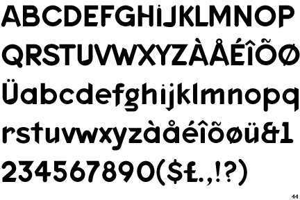
05) write at least 75 – 100 words about the classification
Serifs are the finishing strokes in all letters other than O, o, and Q. Since the fifteenth century, the shape of these little feet has defined the evolution of serif typefaces as typographers reacted to the work of their predecessors and adapted to new printing technologies. Transitionals, with more defined serifs and a more vertical structure, paved the way for a distancing from calligraphic letterforms with the introduction of the Didones- the name derives from Firmin Didot and Giambattista Bodoni- or Moderns in the eighteenth century, with their simplified serifs and high contrast.
06) name 3 fonts that are from that same classification
Baskerville, Trajan, Bembo
07) what was happening in the world in the year the font was designed
On January 14, 1784, the Treaty of Paris was ratified by the Congress of the United States, while they met in the Senate Chamber of the Maryland State House. The Treaty formally ended the Revolutionary War and established the United States as a free and independent nation.
In the North, slavery was abolished in the state constitution of New Hampshire in 1784.
Benjamin Franklin invents bifocal spectacles.
08) name any other fonts by the designer (if the did a lot you can stop at 3)
09) Write at least 500 words about your designer or history of the font.
When designing Didot, Firmin Didot moved away from the handlettering and calligraphic characteristics of the era in search of a cleaner and more legible solution. This was accomplished with high contrast in the strokes and the use of hairlines and horizontal serifs with little bracketing. These changes personified the beginning of the modern style, and Didot became the French standard for over a century. As happens with older, successful typefaces, Didot has been redrawn many times, weathering the process of reinterpretation and new technologies; Adrian Frutiger’s version for Linotype may be the best regarded; but the more modern interpretation by Hoefler & Frere-Jones, designed for Harper’s Bazaar and later made available for retail, features seven optical sizes- from 6 point to 96 point- that optimize each size to maintain the contrast and finesse deserved by the elegant Didot.
The House of Didot in Paris, France, was one of the most illustrious in the annals of typography. In 1789, no less than seven members of the family were engaged in various branches of the book trade. The House of Didot were the King's printers and encouraged the cutting of new types.
The most important of the three generations of Didot as far as type design is concerned is Firmin. He is responsible for the first modern roman typeface in 1784, which became known as "type Didot". It remains France's greatest contribution to type design. was a French printer, engraver, and type founder. He invented the word "stereotype", which in printing refers to the metal printing plate created for the actual printing of pages (as opposed to printing pages directly with movable type), and used the process extensively, revolutionizing the book trade by his cheap editions. His manufactory was a place of pilgrimage for the printers of the world.
Firmin Didot was born in Paris into a family of printers founded by François Didot, the father of 11 children. Firmin was one of his grandchildren. The family's paper manufactory was located at Essonnes, a town c. 30 km southeast of Paris near Corbeil, which had notable paper factories.
France is indebted to the Didot family for the publication of the Biographie Nationale, and Belgium is also indebted for the establishment of her Royal Press. Relatives of Firmin Didot include François Ambroise Didot (1730–1804); Pierre François Didot (1732–95); Henri Didot (1765–1862); and Pierre Didot (1760–1853).
Along with Giambattista Bodoni of Italy, Firmin Didot is credited with establishing the use of the "Modern" classification of typefaces. The types that Didot used are characterized by extreme contrast in thick strokes and thin strokes, by the use of hairline serifs and by the vertical stress of the letters. Many fonts today are available based on Firmin Didot's typefaces. These include Linotype Didot and HTF Didot.
Firmin Didot cut the letters, and caszt them as type. His borther Pierre Didot used the types in printing. His edition of La Henriade by Voltaire in 1818 is considered his masterwork. The typeface takes inspiration from John Baskerville's experimentation with increasing stroke contrast and a more condensed armature. The Didot family's development of high contrast typeface with an increased stress is contemporary to similar faces developed by Giambattista Bodoni in Italy Didot is described as neoclassical, and is evocative of the Age of Enlightenment
10) one quote (by the designer, by someone talking about the font, or a quote about design that "fits").
“Typography fostered the modern idea of individuality, but it destroyed the medieval sense of community and integration.”

Sunday, September 27, 2009

TYPE CLASSIFICATION

Type classification is a system that was devised in the nineteenth century, when printers sought to identify a heritage for their own craft similar to that of art history. Humanist letterforms are closely connected to calligraphy and the movement of the hand. Transitional and modern typefaces are more abstract and less organic. The three main groups correspond roughly to the Renaissance, Baroque, and Enlightenment periods in art and literature. Designers in the twentieth and twenty-first centuries have continued to create new typefaces based on historic characteristics.

Sans Serif- Font that loses the serif. First appeared broadly in the mid-nineteenth century with the introduction of typefaces carved from wood. The increased production of sans serifs in all widths and sizes remains today, as sans serifs prove to be quite malleable.
Examples: Akzidenz Grotesk, Futura, Franklin Gothic

Script- The typographic form of handwriting. Script typefaces strive to translate the inherently dynamic, fluid, and imperfect act of writing into metal, wood, photo, and digital typefaces, amounting to and inordinate amount of choices in a dizzying number of approaches.
Examples: Brush Script, Choc, Mistral

Monospace- Monospace typefaces take their cue from typewriters, where all letters conform to a specific physical width, resulting in letterforms that must expand or condense to make the best use of the allotted space- hence the wide is and tight ms. They are also referred to as nonproportional, in contrast to typical proportional typefaces, where each character is a different width.
Examples: Courier, Orator, and OCR A

Information found from Thinking with Type: Classifications and Graphic Design Referenced by Bryony Gomez-Palacio and Armin Vit.

Tuesday, September 22, 2009

House Industries

In 1993 Andy Cruz and Rich Road, who started a design firm, Brand Design Co, also established House Industries. They were later joined by a third member, Allen Mercer. With the production of its first mailer, House Industries released ten typefaces. Through 1997 they designed quirky typefaces that were delivered via floppy disks. They became known for their typefaces’ packaging. The packages were carefully constructed typefaces specific to a time or culture. House Industries has a large type library with popular sans serifs like Neutraface and Chalet as well as OpenType families like Studio Lettering and Ed Benguiat Fonts. The company goes to elaborate lengths to promote its typefaces including creating chairs, pillows and various other items inspired by the typefaces they sell. In one promotion they created the fictional character René Albert Chalet and promoted him as the creator of a new typeface Chalet.
Chalet- very versitle
Neutraface- designed in 2002 by Christian Schwartz
Ed Benguiat Fonts- Fonts that show tribute to Ed Benguiat, very unique
I really enjoyed looking at the Ed Benguiat Fonts. They carried a lot of character and were just really fun to look at. A very casual font family.

Emigre

Rudy VanderLans and Zuzana Licko founded Emigre in the mid 1980’s. Emigre produced a magazine called Emigre and designed and distributed original fonts. VanderLan led and edited the magazine while Licko made many of the successful Emigre fonts. In the late 1980’s Emigre started to distribute its fonts through floppy disks. Tim Strback of Emigre helped launch Now Serving in 1994, an online bulletin board that allowed users to purchase and download fonts. Licko alone has developed a large font library, with nearly 30 type families to her name- including the font Mrs. Eaves. Through the lifespan of Emigre, the typefaces from its foundry were continually on display and played as significant a role as the content.
Fonts by Zuzana Licko:
1. Mrs. Eaves- transitional serif typeface designed by Zuzana Licko in 1996, Mrs Eaves is a revival of the types of English printer and punchcutter John Baskerville, and is related to contemporary Baskerville typefaces.
2. Filosofia, based on Bodoni
3. Others include Solex and Tarzana, blackletters like Totally Gothic and Totally Glyphic, and the swirling Hypnopeadia patterns.
Fonts by others
1. Dead History, Designed by Scott Makela 1990
2. Keedy Sans, Designed by Jeffery Keedy in 1989 (pictured below)Dead History originally caught my eye because it is a pretty funky font, but Mrs. Eaves is a popular font and looks very classic.

Font Bureau

The Font Bureau, Inc. was established in 1989 by publication designer Roger Black and type designer David Berlow. Berlow started drawing letters by hand early in his career in 1978. In 1981 Berlow started using and experimenting with digital typography. Black was a director of magazines for Rolling Stone, New York, and Newsweek. In 1989 he started his own business with a focus on the design of newspapers and magazines. Which was the same year that he and Berlow established Font Bureau. Black led numerous publication design and Font Bureau created type families; the company has more than 1,500 typefaces today. Font Bureau has a vast and well-rounded collection of typefaces and type families from traditional serifs to less traditional.
David Berlow designed:1. Giza- (pictured above) designed in 1994, font based on Vincent Figgins’s 1845 specimen
2. FB Titling Gothic- designed in 2005, Ideal for newspaper titling due to its nearly 50 styles
3. Moderno FB- designed 1994-2008, Evolving for various clients strting with Esquire and Gentleman and ending with Montreal Gazette
Other fonts by Font Bureau:
4. Sloop- (pictured below) designed by Richard Lipton 1994-2002, Inspired by the calligraphic work of Raphael Boguslav
5. Miller- Designed by Matthew Carter 1997-2000
6. Quiosco- Designed by Cyrus Highsmith 2006, Allows for compactness without compromising legibility

I really enjoyed at looking at the variety that was in the FB titling Gothic font (pictured below). The variety made it fun to look at and the font was eye catching because it looks like headlines to newspapers.

Wednesday, September 9, 2009

Completely random things I enjoy


Mike Stimpson describes himself as a photographer of plastic. I thoroughly enjoyed looking at his photos, because as a kid I always played with legos with my brother. His photography is playful and just all around entertaining.
http://www.mikestimpson.com/gallery/107368#7

Most people aren't big fans of Chris Brown these days, but I still like watching this video when I need a little inspiration out of the ordinary.

Sunday, September 6, 2009

G

Yesterday I went to the Ku football game. Rock Chalk!
Anyways during the game I couldn't help but see the Gatorade logo that was changed this year. Instead of writing Gatorade all over everything, the company now just simply puts a G. Its impressive to me that a sports drink is so well known that a simple letter from the alphabet can represent its product.


Adrian Frutiger was a skilled typeface designer in the twentieth century. He was born in Switzerland in 1928 as the son of a weaver. His father and school teachers discouraged his interests in sculpture and instead encouraged him to work in printing. He was an apprentice to the printer Otoo Schaerffli. He later went to study under Walter Kach and Alfred Willimann in the Kunstgewerbeschule school of applied arts in Zurich.
Charles Peignot from the Deberny and Peignot foundry recruited Frutiger because of his skilled wood-engraved illustrations. At Deberny and Peignot foundry, Frutiger designed the typfaces President, Phoebus, and Ondine. He also created Meridien and Egyptienne.
His most known font is Univers. Universe is the first modular type family designed. It hold a matrix of options totally 21 faces, coded by number. This includes five weights and 4 widths: ultra condensed, condensed, regular, and extended. Univers is unique in that it uses a two-digit code where the first digit indicates the weight and the second digit indicates the face-width. This system is known as the Univers grid.
Universe is a popular alternitive to Helvetica. Universe is very helpful when a wide range of variation is required. The condensed versions can be used as text faces that allow for narrower columns to be used. Although Universe is less known

John Baskerville


John Baskerville was born in England in 1706. He is remembered for being a skilled typographer. He was a member of the Royal Society of Arts. With the help of his punchcutter, John Handy, he designed many typefaces. The University of Cambridge hired him to print works in 1758. He also printed a folio Bible in 1763 despite his atheist beliefs. Since the 1920’s new fonts have been created based off his work and mostly called ‘Baskerville’.
Not only was Baskerville skilled at typography but he also was quite the inventor. He developed ways to produce a smoother whiter paper, which was excellent for showing the contrast between black type. He also established a new style of typography by adding wide margins and leading between each line.
The font New Baskerville reinvents Baskerville’s original forms while refining the font. It has a larger x-height than the Monotype, which improves legibility and makes the face more economical to use. The family also includes a small-cap font. New Baskerville is unique because of its extended range of weights, which consist of roman, semi-bold, bold, and heavy. It is extremely effective when used in larger text sizes and looks very graceful.