Saturday, August 29, 2009
Visual Concepts Assignment #1
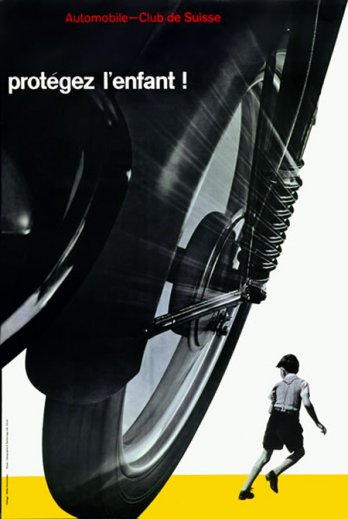
I really liked the section from Type and Image by Phillilp Meggs. Ever since I first started getting interested in graphic design, I have been at a loss for words on how to describe it. I usually just tell people that a graphic designer makes logos and stuff. But that is such a small part of what a graphic designer really is. Graphic Designers do a number of things but they can easily be described as problem solvers and communicators. Graphic Designers have to deliver a clear message to the masses without the meaning being lost or construed. What a daunting but worthwhile task.
Friday, August 28, 2009
Typography Definitions
1. Absolute measurement- Measurements of fixed values measured by units such as millimeters and picas.
2. Relative measurement- Measurements that don’t use fixed values. Examples are Ems and ens that have no absolute size.
3. Point- Unit of measurement that measure the height of the type block.
4. Pica- Unit of measurement commonly used for measuring lines of type.
5. Em (and em dash)- Unit of measurement equal to the point size of the current font.
6. En (and en dash)- En is half the width of an em.
7. Legibility- Based on how easy it is for the eye to read letters and distinguish them from one another.
8. Rag- irregular or uneven vertical margin of a block of type. Usually it’s the right margin that’s ragged
9. Type alignments: flush left- text is aligned along the left margin Advantage it is the default style of text alignment on the web. flush right- text is aligned along the right margin advantageous for languages that read right-to-left. centered- text is aligned to neither the left nor right margin disadvantage is that is harder to read a body of text that is centered. justified-text is aligned along the left margin, and letter- and word-spacing is adjusted so that the text falls flush with the right margin, often used in print media.
10. Word spacing: The ideal word spacing is that as the character increases in size, so should the word spacing.
11. Rivers- Gaps of white space in several lines, usually found in justified test blocks.
12. Indent- Spacing at the beginning of a paragraph to provide easy entry to a paragraph for the reader.
13. Leading- The vertical spacing between lines of type
14. Kerning- adjusting letter spacing in proportional font.
15. Tracking- adjusting the overall space between letters instead of the space between two characters like kerning.
16. Weight- Weight provides a choice on how thick a typeface is. Ex: bold
17. Scale- the point size of a font
18. Typographic variation- Different ways type is used by typographers.
19. Orphan- Final line or word of a paragraph that starts a new column.
20. Widow- One word at the end of a paragraph or column.
Tuesday, August 25, 2009
Josef Müller-Brockmann


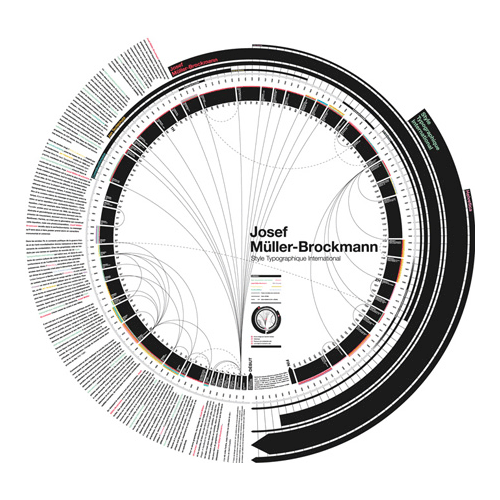

Josef Müller-Brockmann came into the world in Rapperswil in 1914. He is known for being a Swiss graphic designer and teacher. Müller-Brockmann was an apprentice to designer and advertising consultant Walter Diggelman. He studied architecture, design, and art history in Zurich. He eventually opened his own study in Zurich. He became known for promoting the Swiss Style. This style sought a “universal graphic expression” using a grid-based design. This style also left out irrelevant illustration and subjective feeling. He was founder of the trilingual journal Neue Grafik which spread the Swiss Style. He was a graphic design professor in Zurich and in Ulm for a combination of six years. After that he became a European design consultant for IBM. He wrote The Graphic Artist and his Design Problems and History of Visual Communication. He had exhibitions in Zurich, Bern, Hamburg, Munich, Stuttgart, Berlin, Paris, New York, Chicago, Tokyo, Osaka, Caracas and Zagreb. Müller-Brockmann wrote Grid systems in graphic design. This influential work helped spread the use of the grid in Europe and then North America. By the mid 1970s the typographic grid was taught to graphic design students in Europe, North America, and parts of Latin America. The typographic grid continues to be taught today, but is not absolutely necessary for all page design.
Jan Tschichold
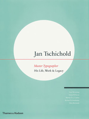


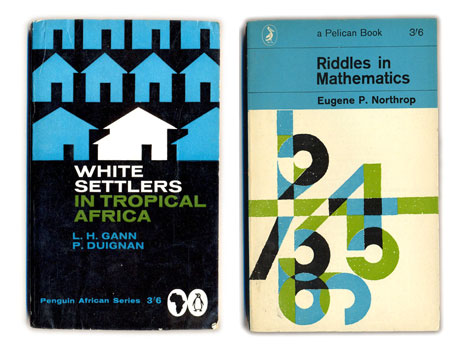
Jan Tschichold made his mark as a typographer in the twentieth century. He was born in 1902 in Germany but lived the end of his life in Switzerland. His father taught him calligraphy, which served as his training to be a typographer. He also studied at the Akademie für Graphische Künste und Buchgewerbe in Leipzig. He found further training under Walter Tiemann and Hermann Delitsch. He was a teacher in Munich until Nazis arrested him for suspicion of working with the Soviets. He and his family managed to escape to Switzerland where he lived out the remainder of his life. Tschichold was greatly influenced by Bauhaus and changed drastically to a Modernistic style. He is well known for his design of the font Sabon, but he also created Transit, Saskia, and Zeus. He designed a “universal alphabet” to help unify the German language. The “universal alphabet” was written in sans-serif with no capital letters. His book The New Typography is now a classic book on typography and remains a great source for designers today. In the book, Tschichold fondness of sans-serif fonts showed through as well as his liking for a non-centered design. In the book he explained how different sizes and weights of type can illustrate different meanings. For a brief period, Tschichold lived in England where he helped publish Penguin Books. He applied many typographic practices while there and during his two year stay he saw 500 paperback books redesigned. Tschichold had grids and rules on page proportion, in which he believed text should go in certain areas. Tschichold’s ideas greatly influenced future designers and typographers who went on to make the modern typographic grid. These days’ grids have recently started being incorporated into the Internet. Although Jan Tschichold died in 1974 his ideas and work are still making an impact on the world today.
Typography Definitions
Grids:
A grid is simply a network of horizontal and perpendicular lines, uniformly spaced. A typographic grid uses these lines to control a space. The grid is there to provide a flexible structure while arranging page content.
Why do designers use a grid? What are the benefits or functions?
A grid helps control a designer’s page content. The grid provides a skeleton that organizes images, texts, and margins in a uniformed way.
Modular Grids:
Modular grids use consistent horizontal and vertical divisions. There are four columns and four rows in a modular grid.
Define and illustrate:
Margins- the space that surrounds the content of a page
Columns- one or more vertical blocks of content positioned on a page. separated by margins
Grid modules- spaces in the grid that hold text and information.
Flow lines- lines between the characters
Gutters- empty spaces between the modules in the grid structure
Hierarchy:
Hierarchy is a way to rank an arrangement of items based on their value or importance. Using different techniques can help a viewer discern which element of a design is more important by imploring hierarchy in a piece.
What are ways to achieve a clear hierarchy?
Hierarchy can be achieved by using different weights and sizes. Also changing the position, case, italicization, and mixing typefaces can all help achieve a sense of hierarchy.
Type Families- A set of one or more fonts that are stylistically related. They can vary in weight and width but keeps the same design.
Type styles- Variations to the font including light, bold, and italic. These present more options within a typeface.
Monday, August 24, 2009
Subscribe to:
Posts (Atom)