
Parts of this article I liked about John Gall
Gall: Different groups within the publishing company will each have different answers for this question. What an editor thinks is good, Sales might not. And as designers we have a different set of criteria, which must also include everyone else’s criteria. How that gets resolved is always a bit tricky. A really great cover is going to convey the essence of the book in a unique and surprising way that maybe pushes the design envelope a bit. It might even add to and enhance the editorial content of the book. A cover that is seen and respected by other designers is a good thing too, I guess, but the mission is really to allow the book to make a great first impression.
Whether people actually buy books because of the cover is open for debate. I mean, even I don’t know, though I’m usually checking the credit to see who is designing them.
SB: Each of your covers has a surprise. What I’ve noted in works by some other respected designers is that, in an attempt to create a well-constructed, prize-worthy creative jewel, the resulting design solution doesn’t surprise the viewer. Cover after cover, how do you find twists and turns and all those creative surprises that continue to jolt and engage the viewer?
Gall: Basically, I am always trying to surprise myself; and if I can do that, odds are others will perceive it as invigorating design. And I’m a big fan of the happy accident, and if I can contradict what I was saying about mass-market books, I will also approach a project from the viewpoint of what I shouldn’t do. Like I really shouldn’t put an airbrushed unicorn on a cover … but let’s see what it looks like.
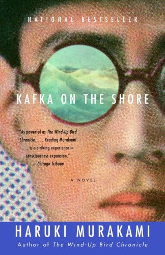
Gall just like Chip Kidd has a way of making all his book covers innovative. Both men work for the Knopf Group.

No comments:
Post a Comment