Sunday, February 14, 2010


Saturday, February 13, 2010
Journal 3: 20 Rules
In the article Twenty Rules for Making Good Design, David Jury acknowledges the fact that rules can be broken but not ignored "In the end, you will decide how and when to apply the rules, or not, as well as understand the results of either course of action."
The 20 rules stated in the article:
1. Have a concept
2. Communicate don't decorate
3. Speak with one visual voice
4. Use two typeface families maximum. OK, maybe three
5. Use the one-two punch!
6. Pick colors on purpose
7. If you can do it with less, then do it
8. Negative space is magical- create it, don't just fill it up!
9. Treat the type as image, as though it's just as important
10. Type is only type when it's friendly
11. Be universal; remember that it's not all about you
12. Squish and separate
13. Distribute light and dark like firecrackers and the rising sun
14. Be decisive. Do it on purpose- or don't do it at all
15. Measure with your eyes: design is visual
16. Create images- don't scavenge
17. Ignore fashion. Seriously.
18. Move it! Static equals dull
19. Look to history, but don't repeat it
20. Symmetry is the ultimate evil.
The 3 most important rules to me are:
1. Have a concept.
This seems like it deserves a duh! after it but often times I jump into a project and forget to really ever come up with a solid concept.
2. Negative space is magical- create it, don't just fill it up!
Often times negative space is overlooked, but it is a major part of design.
3. Symmetry is the ultimate evil.
"Symmetry shouts very loudly that the designer is lazy and likes to let the format do the designing."
The 3 I need to practice more are:
1. Communicate- don't decorate.
"It's all well and good to experiment with shapes and details and cool effects, but if you simply spackle them all over without considering what they mean and how they support or take away from the message you end up with a jumbled mass of junk that no longer qualifies as design.
2. Use two typeface families maximum. Ok, maybe three.
Sometimes I just get caught up in type and I throw in way too many typefaces and way too many different type sizes.
3. Treat the type as image, as though its just as important.
This is a huge problem for me. I am constantly guilty of spending all my time with the image and then the type becomes a last minute decision. It is very stupid to ignore type in a design, when type has so much to offer.
At this point in my education I do not feel comfortable breaking the rules yet. When the time comes that I can fully justify breaking a rule, I will do it gladly.
Wednesday, February 10, 2010


Wednesday, February 3, 2010
John Gall

Parts of this article I liked about John Gall
Gall’s stylish sensibility, simple but elegant use of typography and quietly rebellious spirit infuse these literary works with an added dimension. Subtle and compelling, his covers play with the perceptions of the viewer in unexpected ways, and to satisfying effect. Scanning the table of trade paperbacks at the local bookseller, one would have no difficulty spotting Gall’s distinctive and visually articulate work. Collage, photography, typography and art are all grist for the mill, yet no matter how varied the medium, the end result is pure Gall.
SB: What makes a good book cover?
Gall: Different groups within the publishing company will each have different answers for this question. What an editor thinks is good, Sales might not. And as designers we have a different set of criteria, which must also include everyone else’s criteria. How that gets resolved is always a bit tricky. A really great cover is going to convey the essence of the book in a unique and surprising way that maybe pushes the design envelope a bit. It might even add to and enhance the editorial content of the book. A cover that is seen and respected by other designers is a good thing too, I guess, but the mission is really to allow the book to make a great first impression.
Whether people actually buy books because of the cover is open for debate. I mean, even I don’t know, though I’m usually checking the credit to see who is designing them.
SB: Each of your covers has a surprise. What I’ve noted in works by some other respected designers is that, in an attempt to create a well-constructed, prize-worthy creative jewel, the resulting design solution doesn’t surprise the viewer. Cover after cover, how do you find twists and turns and all those creative surprises that continue to jolt and engage the viewer?
Gall: Basically, I am always trying to surprise myself; and if I can do that, odds are others will perceive it as invigorating design. And I’m a big fan of the happy accident, and if I can contradict what I was saying about mass-market books, I will also approach a project from the viewpoint of what I shouldn’t do. Like I really shouldn’t put an airbrushed unicorn on a cover … but let’s see what it looks like.
Gall just like Chip Kidd has a way of making all his book covers innovative. Both men work for the Knopf Group.
Chip Kidd


Ripped straight from one of my favorite sites....WIKIPEDIA!
Chip Kidd is an American author, editor, and graphic designer, best known for his innovative book covers.
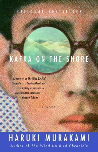
Kidd is currently associate art director at Knopf, an imprint of Random House. He first joined the Knopf design team in 1986, when he was hired as a junior assistant. Turning out jacket designs at an average of 75 a year, Kidd has freelanced for Doubleday, Farrar Straus & Giroux, Grove Press, HarperCollins, Penguin/Putnam, Scribner and Columbia University Press in addition to his work for Knopf. Kidd also supervises graphic novels at Pantheon, and in 2003 he collaborated with Art Spiegelman on a biography of cartoonist Jack Cole, Jack Cole and Plastic Man: Forms Stretched to Their Limits. His output includes cover concepts for books by Mark Beyer, Bret Easton Ellis, Haruki Murakami, Dean Koontz, Cormac McCarthy, Frank Miller, Michael Ondaatje, Alex Ross, Charles Schulz, Osamu Tezuka, David Sedaris, Donna Tartt, John Updike and others. His design for Michael Crichton's Jurassic Park novel was carried over into marketing for the film adaptation. Oliver Sacks and other authors have contract clauses stating that Kidd design their books.
Parts of the Smithsonian Interview I liked:
Q: What do you say to the axiom "Don't judge a book by its cover"?
A: My reaction is, Oh, go ahead.
Q: Does a typical idea come from the book itself, the author, something on the street, a flea market, a dream, or what?
A: It's totally everywhere. Absolutely. And the nice thing about books is the deadlines aren't as crazy as somewhere like a magazine or, God forbid, a newspaper. So, you have the luxury of time usually, to read a book and let it kind of like simmer and percolate in your head. And waiting for the right solution to come along, whether it's something you come up with on your own or a piece of art they you see in a gallery. I would definitely recommend anybody who wants to be a book jacket designer to move to New York City.
My own actual words (which are open for judgement):
Chip Kidd is important to us because there was once a question about him on Jeopardy. Ok thats not the only reason he is important but you have to admit it is a big deal. Book cover designs have significantly improved in the past couple of decades and Chip Kidd has been on the forefront of this development. His ideas are always fresh and and even as he has created thousands of book covers he is still able to create great ideas.
Sunday, January 31, 2010


Subscribe to:
Posts (Atom)